Finally, massive storage done right

Last year, I wrote about my efforts to find a storage server with lots of storage at a low cost-per-byte. What was obvious to me at the time, but apparently not obvious to many vendors, is that the key to cost effective storage is to buy mostly hard drives and as little else as possible. I built on Linux and commodity hardware, but the principle applies regardless of OS or hardware vendor.

The team at BackBlaze went much farther down the same path. They ended up with a custom made 4U case (a bit expensive) while the rest of the parts are few in number, inexpensive, and off the shelf. Their cost overhead is stunningly low, as seen in this chart (which I copied from their article):
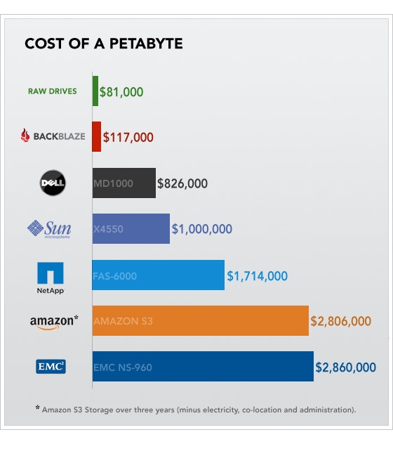
cost-of-a-petabyte-chart

Is this right for everyone? Of course not. Enterprise buyers, for example, may need the extra functionality offered by the enterprise class solutions (at many times the cost). Cloud providers and web-scale data storage users, though, simply cannot beat BackBlaze’s approach. What about performance? Clearly this low-overhead approach is optimized for size and cost, not performance. Yet the effective performance can be very high, because this approach makes it possible to use a very large number of disk spindles, and thus has a very high aggregate IO capacity.

Predictably, the response to BackBlaze’s design has been notably mixed, with numerous complaint about performance and reliability. For a very thoughtful (though unavoidably biased) response, read this Sun engineer’s thoughts.

The key thing to keep in mind is the problem being solved. BackBlaze’s design is ideal for use as backup, bulk storage. That is a very common need; the solution I set up (described at the link above) had a typical use case of a given file being written once, then never read again, i.e. kept “just in case”. Reliability, likewise, is obtained as the system level, by having multiple independent servers, preferably spread across multiple physical sites. Once you’re paying the complexity cost to achieve this, there isn’t much additional benefit to paying the cost a second time in the form of more expensive storage.

Unusual virus which attacks Delphi SysConst.pas / .dcu

There is big news today in the Delphi world: a virus that specifically attacks Delphi installations, inserting a bit of code to embed itself in any application compiled by that Delphi installation. (more info here)

The virus adds code to SysConst.pas, which is then compiled in to SysConst.dcu. (Those are analogous to .c and .o, for those of you outside the Delphi world).

I immediately checked all of my machines (and all Delphi installations on them) and found them all to be clean; but I am obsessively careful about what software I run, and use antivirus software as a second layer of protection on top of that.  All Delphi shops should check for this ASAP.

.NET Compact Framework

Ever since I posted my experiences creating software for the .NET Compact Framework back in 2006, I’ve received a steady trickle of thank-you emails. Apparently there are bits of information in there that are (or at least were, at the time) somewhat hard to find.

Sadly the information there has fallen somewhat out of date due to new CF and VS.NET releases, and I’ve been busy on other platforms and projects (Java and much more) since then. If anyone out there can suggest a handful of the best places to learn now about CF development, please do so in the comments below, for the benefit of others reading this page.

Flex version of my overworn “flying boxes” GUI demo

Long-time fans may remember my “flying boxes” demo at the St. Louis Java user group in 2005, or my followup work in 2008, in which I translated that demo to JavaScript (Rhino).

I picked that demo project up again last year and recreated it with Flex 3; you can now try it out onlinedownload the code, or browse it on github. It looks like this:

Click on it to try it “live” in as Flash/Flex.

The interesting part is the drag-drop movement – not my less-then-stellar color and design choices.

Palm Pre First Impressions (vs BlackBerry Pearl)

Today I set aside my BlackBerry Pearl for a shiny new Palm Pre. There are various detailed, photo-rich reviews out there, and many more on the way. I’ll skip that, and pass a few first impressions of the Pre, particularly compared to the BlackBerry (Pearl, in my case).

  • The hardware is quite nice; the size is only a big larger than the Pearl, with a much larger screen. It fits well in the hand. The keyboard is easier to use that the Pearl, having one letter per key. The screen is bright and sharp. The Pre camera is enormously better than the Pearl camera.
  • The Pre is a bit sluggish, even with the 1.0.2 OS update which is said to improve things.
  • The Pre’s software is vastly more advanced than the old BlackBerry Pearl I’ve been using; so much so that it makes the great hardware less responsive than the Pearl’s much older, weaker hardware.
  • The Pre’s gesture recognition seems rather rough to me; compared to an iPhone I found I had to work harder to get it to do the right thing.
  • The Pre’s browser, while reasonably fast and very pretty, has poor usability compared to Opera Mini (which I used as my primarily browser on the Pearl), or even compared to to primitive BlackBerry built in browser. Both of the latter reformat a web page to fit well on a small device, such that I can read most pages without zooming and without horizontal scrolling. On the Pre, reading a typical web page is an exercise in scroll/zoom tedium.
  • The Pre’s email client appears to use IMAP for Gmail access. This works, but not nearly as well as the native Gmail client available for the BlackBerry. It lacks the most common Gmail actions (“Archive” and “Spam”). I don’t know if WebOS makes it possible for Google to create a native Gmail client; if so I hope that happens soon.
  • The most obvious feature in common between the Pre and the BlackBerry is that both support multitasking, unlike the current (as I write this) iPhone. With a couple of button pressed on the BlackBerry, I can flip over to read email while a web page is loading; the same is possible on the Pre (turn on “Advanced” gestures to make it easy).
  • With the Pre, I’ve made several accidental calls so far. I’m not sure it’s a good idea to use softkeys for placing a call; this is the first phone I’ve used (since my first analog cellular telephone in the early 1990s) to not have a physical button to initiate a call.
  • So far, most of the Pre applications leave me wanting more features, more options, more ability to adjust the device to be more functional perhaps at the expense of being less obvious. I expect the situation will improve as WebOS advances, and I hope very much that new versions run on this existing hardware.
  • The main list-of-apps screen on the Pre is almost like that of the iPhone… except that it manages to get the layout not-quite-right in an absurd way.  It arranges the icons 4+ rowshigh, while allowing room for only 3 to be fully visible; thus navigating the list requires both vertical and horizontal scrolling.
  • The App Catalog displeases me greatly, because when it shows apps available as a trial, it does not show the price of the real app. This is perhaps good marketing, but it is also profoundly disrespectful. There are no prices to be seen, and no affirmative indication of free-ness; according go the Palm support page on the topic, you need to nonetheless “know whether the app is free, must be bought, or can be downloaded in a trial version before you buy it.” Many users have been posting “review” which consist of questioning whether the app costs money and how much.
  • At the moment there are a whopping 2 (yes, two) games in the App Catalog, one of which is a trialware Connect Four from EA.
  • The Data Transfer Assistant, used to copy data from the old Palm world, essentially does not work for me. It runs and reports success, but my contacts from Palm Desktop do not appear in the Pre. It sync my Google contact “down” though.
  • The sync mechanism essentially does not work for me.  It claims to be linked to my Google Calendar, but events do not sync in either direction. I suspect it is silently failing under the hood, but in order to preserve the beauty of the GUI, hides the errors.

As you can see I am not entirely happy with the Pre. Perhaps it will grow on me over the next couple of weeks, though that seems possible only if a very substantial bug fix software release appears in that time.

Updates, over the next week:

  • I manually cleaned up my old Palm Desktop data, then manually renamed a file in the Palm Desktop data store, and was able to get the Data Transfer Assistant to work for Contacts. Next, I purged all old events and some new events in my old Palm Desktop data, then got that data in place (with considerable “tapping” on each event, one at a time!) in to the Pre and from there to Google Calendar. After considerable gyration, the over-the-air sync works well.
  • Prominent multitasking is a very good thing. BlackBerry has had multitasking for years, but I suspect many BlackBerry users never use it.
  • After many tries, the Pre WebOS 1.0.2 update installed, and is indeed a bit less sluggish.
  • I can appreciate more with time, how nice the browser looks; but it is still a big step backward for effective use on a small screen, compared to Opera Mini. The Pre is so tedious that I find myself browsing less than before, even though I just got a slick new device.
  • While it’s tedious to read many sites with the main browser, the site-specific Apps for the New York Times and AP wrap text correctly and are easy to read.
  • The Pre’s interface for making phone calls is disappointing.
  • I greatly miss the Gmail email client that I used on the BlackBerry. The Pre’s email lacks very basic capabilities, for example there is no way to delete/archive/file a message without opening it. With Gmail on a 2-year-old BlackBerry it is feasible to handle dozen of messages (read some, don’t read others, archive some off, mark a couple as spam, etc.) in a minute or two, with one hand and typically one keypress per message. With the Pre the same work takes two hands and many minutes, mostly because of the load time to open each message followed by multiple taps to process it.
  • The Alarm Clock puts a notification icon at the bottom of the screen permanently, for no apparent reason. Hopefully an upcoming update will make it possible to use the alarm without permentantly losing a strip of screen space.
  • Battery life on the Pre is short. Starting in the morning at 100%, after a long day of sporadic use it is down to 20%.
  • Battery life on the Pre is really short: fully changed at midnight.  7 AM, down to 82%. Less than an hour of casual use, down to 52%.
  • I am not at all convinced that touch screens are well suited for cell phones. I’ve found it much more difficult to place calls, answers calls, and avoid accidental operations.

My comments above are surely slanted toward the negative; but as a lifelong “early adopter” my patience is considerable. Perhaps I’ll grab the SDK and work on an App or two myself. At least a portion of the Pre’s weaknesses could be effectively addressed by high quality third party apps.

Update, after a few more days:

  • I gave up, and returned the Pre. I’ve carried a cell phone since ~1991, upgrading every couples of years; this is the first time I’ve ever returned one.
  • It’s not you, it’s me. The Pre is a great piece of equipment, for its target audience.
  • I got a BlackBerry Curve 8900 instead; it is a much more advanced successor of the Pearl.
  • Compared to the Pre, the Curve has perhaps 100x more adjustments possible, to make it do what I want. It multitasks. It has a physical keyboard of high quality. Its battery lasts a long time. It runs its own (weakish) browser, and also runs Opera Mini. Thanks to Google’s sync tools, it offers a synced calendar and contact list.
  • The Curve GUI is not as pretty as the Pre; but it is of very high usability, even one-handed.
  • T-Mobile pricing is similar to Sprint, but T-Mobile includes tethering at no extra cost.

The Right Way to do Monitoring and Mass Administration

Over the weekend I flipped through these slides about Nanite (code), and it got me thinking about system monitoring (again), as well as mass administration tools (Puppet and its younger competitor Chef). The key bit from the talk is the idea of using a proven, off the shelf messaging server (RabbitMQ) as the communication bus among a set of processes running on many servers.

I would like very much to see a piece of software that puts these pieces together:

  1. Monitoring features, like those in Zabbix or other similar tools
  2. Mass administration features, like those in Puppet
  3. Run it over a messaging bus rather than a homegrown communication mechanism

Such a system would allow some very nice improvements:

  • The messaging bus could provide real time “presence” information.
  • Urgent events could be sent immediately, rather than polled.
  • Urgent administration changes could be sent over the same communication channel as normal operations, unlike (for example) the puppetrun mechanism is puppet.
  • The specification for how a server is configured could be integrated in to the specification for how it should be monitored. This would be an enormous improvement over the current state of the art (in open source tools anywhere) where these two concerns are separated in to tools that don’t talk to each other.

In addition to the feature improvements, I suspect that both kinds of tools (monitoring and administration) would find they can get by with a smaller codebase by outsourcing the communication bus to a messaging server.