Here is the first, in hopefully a series, of posts about basic software design. Though not nearly as sexy as a location-based mobile social network with behavioral profiling for ad optimization (probably a real thing), doing basic software design well is one of our “secrets” at Oasis Digital. So here goes.
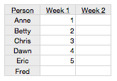
Today’s topic is how numbers should be formatted for tabular display. This comes up quite frequently in data-centric applications. For an example, consider this mockup of a working-hours-per-person display screen, example 1:

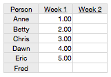
It looks quite nice with the numbers formatted trivially as whole numbers. What if someone worked 4.56 hours, though? How would that appear? To accomodate that possibility, you might always show two digits to the right of the decimal point like so, example 2:

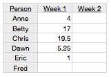
… which is OK, but not great – all those extra zeros distract the viewer from the essence of the data. One thing you should never do, though, is something like this:

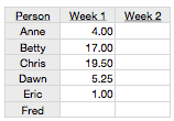
This is horrible. If you feel tempted to write software that displays data like this intentionally, please step away from the computer now. This breaks the rules of writing numbers that we all learned in primary school, probably before the age of 10: always line up the decimal point. Instead, for that particular set of numbers, the is reasonable:

So is the answer to always display as many decimal digits as the data could possibly have? Perhaps, but only if you are unable to dynamically change the format based on the contents of the data. Examples 2 and 4 show a safe but unimpressive approach.
If you have the tools and skills to create a high quality solution, aim higher: dynamically choose the right number of decimal digits, to fit the specific data in question, then apply that same format uniformly to all the numbers. The output will therefore look like #1 if the data permits, and like #4 if the data requires it, but will not needlessly fill a column with 0s as in #3. This is more work, but is a more polished, professional result.
